The Official Color Trends 2021 for the Modern Home Curated
by The Contessa of Cavalieri Designs
The Contessa of Cavalieri Designs (Modern Interior Designer, Claire Cavalieri) is here and has handpicked the Official Color Trends 2021 for the Modern Home that represent timeless beauty, serenity and joy. These 3 modern colors are intended to elevate your comfort, health and happiness so you’re inspired to create the life you most desire. Real life-applications are presented to demonstrate how you can use each color trend in your world.
The official 3 color trends 2021 selected by the Contessa are…drum roll please…
– Candlelight White created by Cavalieri Designs
– Iron Ore by Sherwin-Williams
– Fortuna Gold recognized by Shutterstock
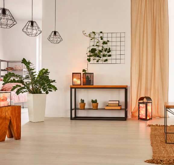
To begin with, these 3 color trends create a warm color palette. (Except for Sherwin-Williams Iron Ore, which is considered a neutral hue, meaning its undertone is neither warm or cool. More on that later.) The beauty of these pigments is that each can be used individually OR they can be selectively paired (for example: Candlelight White walls combined with an Iron Ore accent wall) OR all the colors can be grouped together in one color palette (for example: a color palette for a room design).
Color Trend 2021 #1 - Candlelight White
I once read somewhere quite a while ago that skin tones look best bathed in candlelight. Who can argue with this? What if your paint color, aptly named Candlelight White, could enhance the skin tones of everyone in your room with a bit of a “flush” look?

The multitude of colors in candlelight are quite flattering to all skin tones because they’re in the warm band of hues on the Color Wheel, ranging from assorted shades of reddish-pinks to shades of yellow-golds. When in a room filled with candlelight—say, in a restaurant–people’s skin always looks illuminated and warm, reflecting a vibrant, healthy glow. This is why women’s blusher, for example, is commonly formulated in shades labeled Peach, Rose, or Bronze and often contains a luminescent quality to highlight the complexion.
Cavalieri Designs has simulated the “candlelight effect” for paint by creating its own custom color that can be applied to any room in your house. We’ve named it Candlelight White (HEX code #FCF8FC). It’s a warm white with a soft undertone of blush that warms all skin tones with a look of health and vibrancy.
How to Mix the Custom Formula for Candlelight White Paint
Below are the steps to mix the custom paint formula for Candlelight White paint. These steps are a bit of a trial and error the first time around.
1. Start with a warm white paint color such as Sherwin-Williams Alabaster or Sherwin-Williams Greek White. Be sure to dip a paint stick in your white paint and dry it to use as your baseline to measure against your custom mix.
2. Ask your favorite paint store like Sherwin-Williams to mix in 5-10% pure Red (such as Sherwin-Williams Radish)
3. Start on the low end (5%), then look at the paint to see if it adds just enough tint to give a “blush glow” to the paint. It’s not supposed to look pink. It’s supposed to look white with a soft blush undertone when it’s on a dry wall. If 5% doesn’t give a very slight blush effect, add a few more percentages of Red until you see the effect you prefer.
4. The best way to judge whether the percentage of “blush glow” undertone is taking effect is by dipping a paint stick in the mix and drying it, then compare it to the white dip stick.
5. Try a small sample can of your custom formula first, and apply the sample paint on a wall at your project in different light exposures. You can always adjust the formula until you get it just right!
Real-Life Application
This trending color is an excellent background for any single room or the entire interior of your modern-designed home where you desire a sense of warmth. The true white-blush chroma is challenging to reproduce here in this article due to the pale nature of its color. To stress again, Candlelight White is our first color trend 2021 selection–a warm white with an undertone of very soft blush. Beautiful indeed!
Color Trend 2021 #2 - Fortuna Gold
This rich color (HEX code #DAA520) appears in Shutterstock’s 2021 Color Trends report, and we absolutely love it! Quoted here verbatim from Shutterstock’s report:
“Fortuna is the Roman goddess of good fortune. Maybe you know her as Lady Luck. This warm, deep gold is her color, representing chance happenings and happy coincidence. Like dappled sunlight at golden hour or autumn leaves lining city streets, you can find this exquisite yellow in life’s brief, shimmering moments of felicity and fate.

Fortuna Gold is a dark, rich shade of yellow. Its color spectrum features variations on gold, from light shimmering pastels to dark, almost metallic golden browns. Fortuna’s direct complement is Cerulean blue, creating a high-profile palette that brings to mind fields of wheat and deep blue skies. For a gentler color palette, try Fortuna Gold mixed with other earthy tints like alabaster, terracotta or ochre. At its heart, this golden yellow is high drama, and it likes to be paired with other intense colors. Create a striking palette by embracing its amber qualities and pair Fortuna Gold with other jewel tones, like amethyst purple and turquoise green.”
Real-Life Application
There are so many opportunities to apply this opulent gold color in your world, from fashion to fabrics. The related interior design photo illustrates a project Cavalieri Designs completed last year utilizing varying values and textures of luxurious gold, including Fortuna Gold, in a Modern guest bedroom which the homeowners and their visitors just love.

Color Trend 2021 #3 – Sherwin-Williams Iron Ore

Popularly considered a neutral or even a cool tone, I find this velvety Sherwin-Williams Iron Ore paint color warm and comforting, much like a sable fur coat. In a certain light, Sherwin-Williams Iron Ore may look black to some; but, in fact, this paint color is actually a deep, dark charcoal gray color found on the grayscale Color Wheel (progressing from white to black).
Depending on the room it’s in, the quality of light and the immediate surroundings, Sherwin-Williams Iron Ore may cast cool undertones of dark blues or violets, slightly warm undertones such as mahogany, or no undertones at all.
Real-Life Application
Often used in high-contrast applications such as an accent wall with white trim work or as a half-wall above white cabinetry, Sherwin-Williams Iron Ore looks dramatic and makes a powerful statement. It’s frequently use on exteriors, doors, cabinets, and feature walls. It is rich, elegant and works well with most styles but particularly Modern design, Contemporary style, and Transitional decor.

That’s a wrap! To summarize, the color trends 2021 for the modern home are Candlelight White by Cavalieri Designs, Fortuna Gold, and Sherwin-Williams Iron Ore. These spectacular colors represent the timeless qualities of beauty, serenity, and joy which are intended to inspire you to create surroundings that elevate your well-being.
When you’re unsure about which paint colors to choose or you’re thinking about starting a design project, contact Cavalieri Designs. I’d love to talk with you, help you reimagine your space, then design the vision for you so your dream home comes true.
With Gratitude,
Contessa
The Contessa
Claire Cavalieri
Modern Interior Designer
Related Blog Articles
")
4 Essential Tips to Select a Pleasing Color Palette for Your Room

Leave a Reply